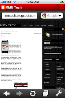
We never thought it would happen. They must have gone nuts at Cupertino. Apple has released a rival browser for the iPhone. The company is notorious for banning apps that "duplicate" the function of their own. So why did Opera Mini get through? It's an easy question to answer. Opera Mini for iPhone just isn't vary good.
The browser does have a few nice features. Opera has included an entirely new and intuitive user interface. It's vary similar to desktop Safari's "Top Sites" feature, which lays out your most visited favourites on a grid as soon as you open it. Each site has a little icon so you can quickly see which one it is.
Tabbed browsing is also better than mobile Safari. Press the icon at the bottom and you can see each tab you have open along with what pages they are, rather than having to flip between them.
Opera has other features that Safari doesn't have, such as searching for keywords in a web page, and saving web pages to memory so they don't need to be reloaded each time. It can also save a static image of a page to storage for quick referral.
Despite all these advantages, Opera Mini is crippled by some major flaws. While Safari can display most web pages flawlessly, Opera struggles. Some pages have formatting problems. Stuff gets moved around or doesn't display properly. When loading Anandtech for example, the entire top navigation bar goes missing, making it impossible to get around the site.
Zooming is also atrocious and imprecise. It won't wrap text on double tap like Safari does. The zoom feature is clunky and a bit too fast for my liking. Opera also seems to have this problem where it will go back or reload the page by itself. I'll type out a forum post, hit done, then it reloads the page and wipes my post out.
Lastly, it lacks auto-correct. Using the iPhone's tiny keyboard is hard enough. You don't realize how much auto-correct helps when you make type-o's. You know, for those of us who don't have child's fingers. So you'll often find yourself going back to fix words that got misspelled.
The biggest problem with Opera is it's just unusable as an everyday browser. I think there's a lot of potential here. It could be a Safari beater with a little time and some patches. But right now, it has too many problems. They need to get working on fixing these issues pronto.
Score: 6 out of 10
What Works:
-Faster than Safari on EDGE
-Innovative user interface
-Adds some features like page saving and in-page text search
What Doesn't Work
-Poor zooming
-Doesn't display some pages correctly that Safari has no problems with
-No auto-correct for spelling
-Does weird things like re-loading pages by itself

0 comments for this post